Intro
Welcome to Jabber Jazz | Fan-driven, Ad-free content on Utah Jazz basketball
Adam Bushman Twitter | @adam_bushman
Today:
- The definitive review of the rebrand
- What’s actually bad/good
- Did the team use good practice
- What’s the legacy of this branded era
- How would we see it evolve
Guests:
- Tiffanee Gurney: @tiffanee_dawn
- Some of the strongest rebrand takes on Jazz Twitter
- Jazz Uniform Tracker: @JazzUniTracker
- The fan/designer consultant on the actual rebrand
Like what we’re doing? Consider…
- Subscribing
- Following
- Leaving a review or comment
- Snagging some merch
What’s actually bad/good?
- Lead up
- 2021-22 season
- Redesigned stadium
- Unofficial graphics
- Font-gate
- Black & white
- The colors
- Black, white, yellow
- Yellow was a concession mandated by the league
- Symbolism
- White/Black: piano keys
- Yellow: spotlight on greatest performers
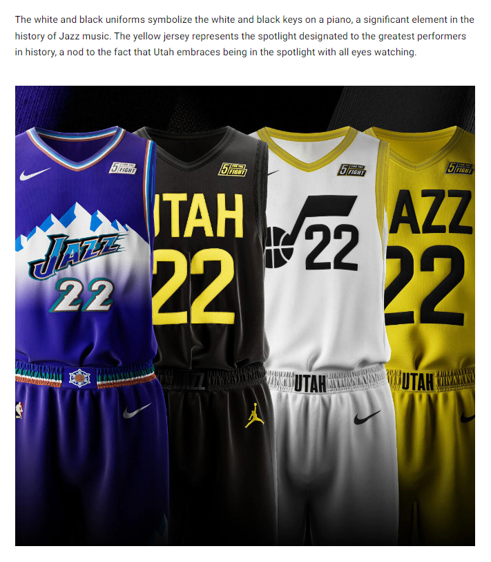
- Black, white, yellow
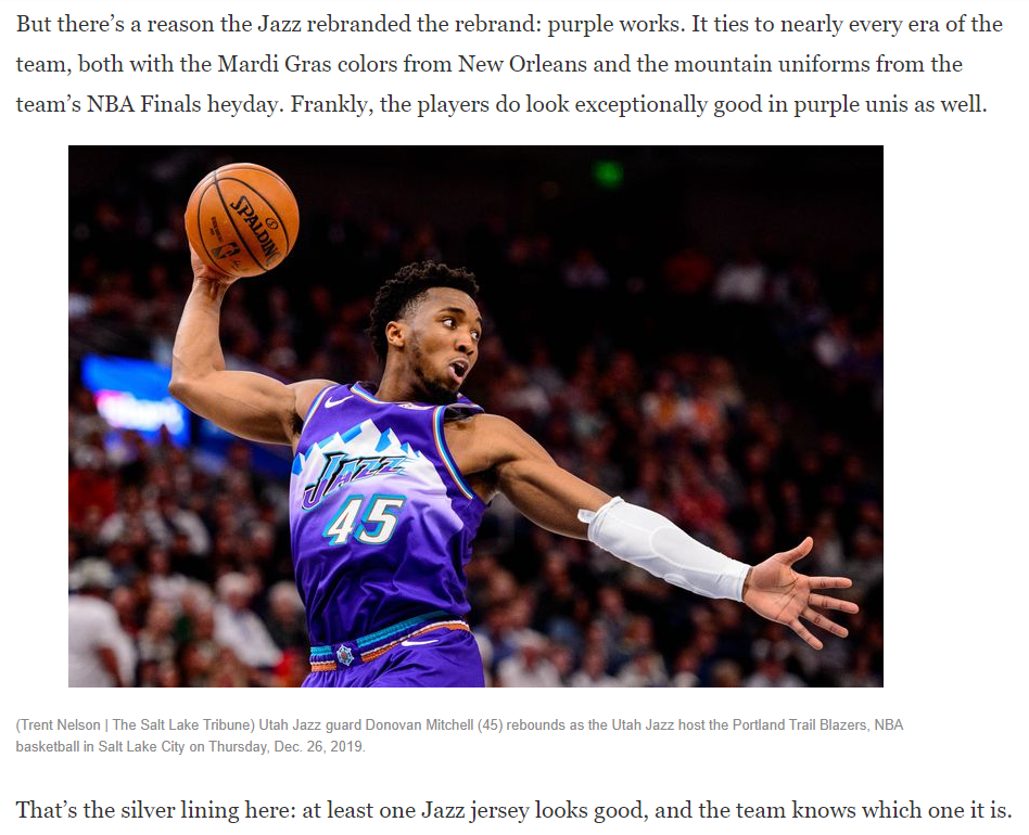
- Purple is Back
- Release video
- Starts and ends with purple
- 68 secs purple, 33 secs of new kit
- Salt Lake Tribune reported it was a last minute add when fanbase reactions were poor
- Release video
- The court
- Angled light flooring
- Silver accents
- Black and yellow point work
- New note/primary logo
- Primary logo doesn’t feature “Jazz” or “Utah”
- No accent mark, thinker stem, different angle
- More identifiable and easier for digital use
- The fonts
- Lots of block, capitalized letters
- Weird, mismatched size and width

- The jerseys
- Association: white, black lettering, silver & yellow trim
- Icon: yellow, black lettering, silver trim
- Statement: black, yellow lettering, black trim
- The merchandise
- A lot of meh, basic, “IT IS YOUR BIRTHDAY.” energy
- The overly yellow is legitimately tough to like
- A lot of the purple is nice
- The black and white, highlighting the note, is pretty cool
Did the team use good practice?
- Came in wanting to fix an “identiy crisis”
- Reports of “echo chamber”, “affirmative action” type focus groups
- Lots of talk of Ryan’s personal project
- Expediting the process with half steps
- Last second “purple” angle
- Awful PR
- Ryan admitting there’s stuff he didn’t like
What’s the legacy of this era?
- How does this branding era go down relative to the others?
- Can the Jazz ever achieve a consistent identity?
- Will fan base pressure provoke a change this big?
How would we see it evolve?
Assume Nike insists the team continue with a 90% facsimile of what the current brand is, what do you change?
When Jazz have their next opportunity to rebrand, what do you do?
Close
Thanks for listening!
Like what we’re doing? Here’s how you can support
- Subscribe
- Leave a review
- Score some Jabber Jazz merch